

Dax Castro
Welcome to another episode of Chax Chat. Join Chad Chelius and me Dax Castro, where each week we wax poetic about document accessibility topics, tips, and the struggle of remediation and compliance. So sit back, grab your favorite mug of whatever, and let’s get started.
Chad Chelius
Welcome, everyone to Episode 15 of the Chax Chat podcast. My name is Chad Chelius. And today’s sponsor is no one. We have no sponsor this week! So if you are interested in sponsoring our podcast, please go to chaxchat.com and leave a comment on one of the show notes. And we will get back to you. Dax, what’s going on this week?
Dax Castro
Well, Chad, you know, we’ve made it through the heat wave. And now I’m going to Seattle for my son’s wedding, and leaving my 18 year old in charge of 40 chickens, 17 rabbits, an alpaca and a tortoise. So I’m hoping that all the numbers will be the same by the time we get back.
Chad Chelius
It will and I know that although an 18 year old is technically an adult, they’re not quite there yet.
Dax Castro
It’s a sliding scale, and they could buy a firearm. I’m not sure they’re capable of taking care of a gaggle of geese or a pack of wild rabbits. So it’ll be interesting. So you know, cool. Yeah. But anyway, you know, Chad, today, I really wanted to focus on maps. Right? So earlier this week, you and I were noodling back and forth over a complex map situation. And I think this is something that a lot of people could benefit from having a broader understanding of the topic, right? Because maps can be all over the place, right, Chad, I mean, they can be, you know, a variety of different you can have a street map, you could have a campground map, you could have a campus map, you could have a, you know, any kind of map of a mall, right. And there’s lots of different things.
Dax Castro
Whenever someone brings me a map, and says, we need to make this accessible. My first question, and this should be for everyone is what is the expected user experience? Right? Because we want to know what you want to get out of this. Now, some people might say, well, a map is just a general representation of a specific area showing the five or six key points or however many X key points, right? Others might say, well, I need they’re gonna use this map to get from one side of the campus to the other, and they need to use this map to get to their classes. Those two user experiences are completely different when you say,
Chad Chelius
Absolutely. And you know, I mean, this, question or this topic? I mean, what you and I have dealt with this multiple times. But the question stemmed from a training that I was providing. And during the training, you know, somebody said, Hey, I have a question, what would you do with this? Right, and it was literally a map of a college campus, you know, and, you know, to your point, Dax, you know, the first thing I said is, well…
- What is the intent?
- What is the purpose of this map?
- What are you hoping that the user is going to get out of this?
Chad Chelius
You know, and (right), and it was interesting, because, you know, sometimes we have trouble thinking the right way, because somebody in the class had mentioned, well, what am I supposed to do? Tell them to take 40 steps West? And, you know, and I’m like, No, no, you know, you just need to tell them, again, understanding the intent, but where a building or a restroom or or a bus stop is located on that map, you know, so you can reference a cross street, right, you know, there’s a number of ways of approaching it, but, you know, I had explained to them, you know, what you would want to try to say is like, This building is on the corner of Oak and Chestnut Street, you know, or something like that, so that they can get there, you know,
Dax Castro
Well, you know, if you take the example of like a campground map. So I’ve dealt with the forestry department, and, and they’ve given me some maps to say, Hey, we need this map to be accessible. We don’t understand how, what that means how to make it accessible. And I tell them, Look, the idea behind the campground map is they need to know is your campground divided into some specific areas? Is there Section A and Section B and Section C? Are there restrooms in certain sections? Is there a fire pit for ash? You know, for ashes? Are there showers? Is there a dock? They don’t need to know where these things are specifically?
Dax Castro
Because obviously they didn’t drive there by themselves. They have other people with them typically. Right? But from a screen reader standpoint, I need to be able to know that there’s a fire pit so that I can go ask someone or get help and say, Hey, you know, can you tell me where the fire pit is right? Now, if your intent is that they’re going to use that map to find everything, well, then you have to take extra steps, right. And that might be an expanded description, it might be a link to a website that says, you know, pick your starting point, and pick your ending point.
Dax Castro
And there’s a database that gives you the directions based on what starting point and ending point you picked. I mean, you can go crazy with how accessible you want that user experience to be. But if you don’t understand the question of what is the expected user experience, then you really are trying to get to a destination, you have no idea where you’re going, you’re just like, Well, I know accessibility is out that way. I’m just gonna keep walking, and maybe I’ll hit it.
Chad Chelius
You’re right. But but we have to be careful too you know, you had mentioned like, typically, they’re likely to have somebody with them. But listen, you know, of all the places that are accessible cities are probably more accessible than most places, because I have seen visually impaired people taking the bus. And they’re completely alone. I mean, they they’re fully functional, they could totally achieve their desired result. But in a city, I think it’s a lot easier than in a rural community, like where I live, right, you know.
Dax Castro
And I was thinking of specifically a map for a campground, if I’m going camping, I’m probably not. And if you are, that’s great, and I applaud you. But getting to a campground being blind or being completely blind or being having partial sight to where you need a screen reader to dissect that map for you. I mean, that’s a specific skill set, right? (Sure). That’s a specific instance. And so, you know, the idea behind the example was really to say, sometimes you overthink it. Yeah. And really, it is about the general information.
Dax Castro
Now, if, if my campground site number is A-65, and I get into the campground, and A-65 is in the you know, it’s got some section name, let’s just say it’s in the Muir Woods section, right? I need to know that information. (Yeah), on a map, I would want to know that A-65 is in the Muir Woods section. So I might say for a description, right, the, you know, campground map divided into five sections, and here are the sections, and maybe you list A through J is in the, you know, Muir Woods section and, you know, K through L is in the you know, and you kind of go down that way, you have to think about how that person might use that map, and what is that intent?
Dax Castro
You know, one of the other things to think about really is the use of color, right? You know, we talked about the the non sighted accessibility of a map, but there’s also the colorblind accessibility of a map. And so many times I see the use of red and green in maps that signify, you know, one thing or another, the other thing to remember is that red can appear as gray, or green can appear as gray to certain people with certain color afflictions. So even though you don’t have red and green together, you might have shades of grey and green, or shades of grey and red. And those might be barriers as well.
Dax Castro
So using color alone, so the Web Content Accessibility Guidelines says that color cannot be the only means of communicating information, indicating response or prompting an action, right, and in a map, it’s differentiating an item, right? And all the items in red, have firepits. All of the items in blue, have wheelchair access, right? Those types of things can be a colorblind barrier. So we have to incorporate different things that are beyond color. Right, Chad? (Yep) So, you know, I mean, I personally am a fan of labels, right? If I can, it’s a more elegant solution to include labels, maybe it’s an L or a letter inside the symbol for that campground name or number. You know, what are some of your favorites?
Chad Chelius
Yeah, when you’re talking about and, again, you know, I live in the design world, right? And, and I deal with this all the time where designers have been taught to do this, right? I mean, they’ve taught they’ve been taught to use color to differentiate items. You see this with a bar charts all the time, right, where they’ll use color to indicate, you know, a topic right and then each bar has a different color right and right, it makes sense visually, but you know for accessibility purposes, it doesn’t work and maps are very often the same thing.
Chad Chelius
Like restrooms for example. Like, you know, you can’t just make all the restrooms, red right? Because I need to know and that’s you and I had a little sidebar on that, because I’ve been in situations where I needed a restroom, and I waited longer than I should have to find one. And I know, you know, you get into a bit of a pickle and for, for somebody who is impaired, you know, they need to be able to find, you know those elements that’s kind of like the role of that map. So, to your point, text labels are great. I’m getting back to, you know, my class, I had made the suggestion. And with a program like InDesign, we can implement some little tricks.
Chad Chelius
You know, and we had talked about this before, but I had suggested have text that says, buildings, like have a heading that says buildings and say, you know, this building is located on the, you know, corner of this street and this street, and this building is located on the corner of this street and this street, then you have a heading called restrooms. There’s a restroom available on this corner and a restroom available on this corner. So and you had said, you know that was a one approach to the problem, right? You know what I mean? That’s one way you could deal with that. And, and we could actually completely artifact the map at that point, because the text is replacing what that map was trying to convey.
Dax Castro
Right? And you know, and we do that a lot, where we’ll have an item in the foreground, that is not read by a screen reader. But the items in the background behind the map are the text layer that’s hidden, because a lot of times, you know, our supervisors are like look, we don’t want to add a, we don’t want to make this a three page map. It’s a single page map, how do we make it accessible? And so we have to use some different tricks.
Dax Castro
Now, you mentioned bar charts, right? So differentiating colors series, a data series, and in a bar chart, we often think of patterns, right? So our accessibility differentiators when it comes to maps or when it comes to color is stroke. So we can have a solid stroke or a dashed stroke or a double line or some kind of differentiator that way, right? We have pattern fill, which in accessibility, it’s typically where you start, right? We start when someone says, Oh, it’s got to be different, it can’t just be color, we’re in Word, usually, we throw a pattern fill at it. But the problem with that is when you have a data series with only two sets, it’s not that bad. You’ve got a solid color and a pattern color. But when you’ve got four different data sets, now you’ve got a solid color and three different pattern sets. There is such a thing as too much right? So I really feel like that’s where you can introduce a letter at the bottom of the base of a bar.
Dax Castro
Now inside Word that’s much more difficult because there’s no tool inside the Excel chart to allow you to do that you have to kind of scab something in over top right. So the approach is going to be different depending upon the the the method you use, and creating pattern fills inside illustrator to export out can be very complicated and take some serious time to set up. So you know, it can be a heavy lift. Right. So pattern fills is definitely one. The other is shape. Right. We talked about restrooms and all that if you have the restrooms are a triangle. And the I don’t know, the campus icons for the different rooms are squares, right? And then you have circles for the emergency phones, right? Yeah, emergency phone poles, you know, those are all different ways. Now, I don’t care what color it is. I know all the triangles are this all the circles are that all the squares are this, right? And any combination thereof.
Dax Castro
One of the things I think most people have problems with are these big heat maps, right? (Oh, yeah), shows, you know, red and green and yellow. And it’s all blends together. And somebody asked me, Well, how do you make this assess accessible? Right? There is a clause inside the Web Content Accessibility Guidelines that says, unless there is no other way to present the information, really, there’s no alternate way to make heatmap it goes from red to yellow to green, you know, orange, and all those different colors. Right? You’re not gonna be able to differentiate the fluid gradient in between all the different sections.
Chad Chelius
Yeah like, you’re talking about, like a map that’s showing like temperature differences, you know, like across the land map or something like that. Yeah, yeah. Yeah.
Dax Castro
I mean, invasive species in (Oh, sure). In a geographic area, like how many turtles are in this area? Or how many eels or whatever, you know,
Chad Chelius
Now Dax, doesn’t that become a little bit subjective? Right, you know, I mean, like to say that there’s no other means of representing this information. You know, doesn’t it?
Dax Castro
I would say, I would say yes, in probably limited cases, but no in quite a few.
Chad Chelius
So you could pretty much look at that and say, You know what? I can’t describe this accurately. And you just basically… What do you do in that situation?
Dax Castro
Well describing is different, right? So when you’re talking about the visual accessibility of the heat map. Let’s just say it’s invasive species of frogs in a geographic area, right? And we show a heavy concentration in this little valley. And and that’s really the main point, right? Well, alt-text is easy. Sure, you know, heat map concentrations showing severe concentration in the valley sort, you know, when you give coordinates, or you can give a general area or a valley name or whatever, that’s pretty easy.
Dax Castro
But the visual aspect of that heat map, that’s the part that’s harder, right. And so you think a population density maps. Same kind of thing. Voter registration, maps, Democrat, Republican, other, you know, those types of things. When you start getting into those fine minute. gradations in between one data set and another, you really can’t label everyone. You can’t, you know, now, if it’s democrat republican or something like that Party A, Party B, that’s easy. One is a pattern fill the other is not sure, right. But what happens when that square that represents one of those little areas is so tiny that you can’t really see the gradient or the the texture fill inside it. So there’s, there’s oftentimes not a perfect solution. But I think it’s pretty clear that when it comes to the if there’s no other way to present the data, you’re talking about heat maps, density maps, things with gradients in them, right?
Chad Chelius
Well, and once again, I think we’re getting back to what is the intent because even with a heat map, you’re not getting accurate data, you’re getting generalized information. And the same rule applies to like charts and graphs, right? And I often say to the customer, is this chart showing specific data values? Or is it showing a trend over time, right?
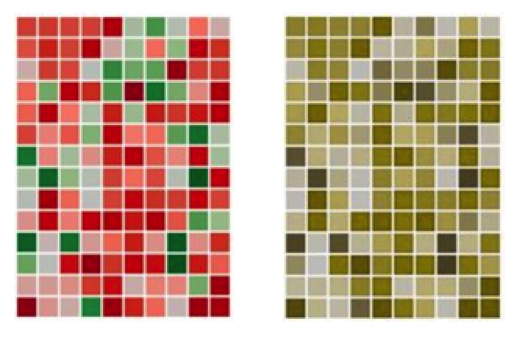
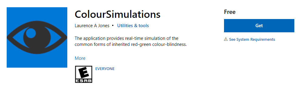
Dax Castro
I will tell you Chad, that there’s been times where I’ve seen a heat map that is literally red, and green. Those are the only two colors in it. And it’s showing a gradiation in between, where the red area and the green area. And if you put a colorblind checker… Microsoft has, it’s called Microsoft Color Simulations. And we’ll link to it in the show notes. Again, guys, if you’re listening to this podcast on your favorite pot, streaming platform, realize that on Chaxchat.com we do have a full transcript with links to things just like I’m about to say, which is Microsoft’s colorblind simulator, right. And when I put that simulator over this map, it was one solid color, there was no differentiation between the red side and the green side.
Chad Chelius
That’s a great tool.
Dax Castro
Yeah, so the idea is that you really need to be able to analyze. So what does that mean? Does that mean you can’t create a heat map like that? No, it means you need to pick two different colors or different tones. So maybe your red is much darker than your green, right? Now. When you put that colorblind simulator up, now you get a nice dark area and and a lot lighter area. And of course, there’s going to be some mix in between, but that’s you’re going to get that with a regular color map anyway, right? So there are ways to make something that is seemingly inaccessible, much more accessible, regardless of the disability that the person has. right?
Dax Castro
And and we know colorblindness affects up to 10% of white males. It has to do the rods and cones in your eyes. And from a humanistic standpoint, people who are more Caucasian in complexion have a higher propensity for colorblindness. People with darker skin have a lower propensity. And if you’re female, it’s .2% of the population. So it’s really negligible. But there are people out there I know a person who happens to be African-American who is a female, and she’s colorblind. She’s a very minute percentage of chance, but they are out there, right? More than likely, you’re in an area that’s predominantly white. [An] Eastern European area, where it’s mostly white people, you’re going to get a much higher incidence of colorblindness. But again, it doesn’t matter. You don’t go, Oh, well, I’m not going to do accessibility because I’m in this area, that’s demographically not going to be important, right? (sure) accessibility is accessibility, it doesn’t matter where you go.
Chad Chelius
Yeah. And so another option you have there is to use expanded descriptions, right? So, you know, you can you could take a document and potentially use, like numbered references on the manager, and then you could have it link to a more extensive description of what that is about. So, you know, initially it’s providing a brief, you know, reference to what you know what you’re looking at, and then if they wanted to know more information, they could follow that expanded description.
Dax Castro
So, more like a key where you have, you know, you have your alt text for the map overall. But then on-page, maybe it’s got items one through six, and you’ve got a description that says what item one is and what item two is and what item three is, right? That right thing? (Yep.) Okay. Yeah, yeah, that’s definitely a good approach. And, you know, again, it goes back to the whole idea of, well:
- How much real estate do we have?
- How much leeway do we have?
- Do we have the ability to have two pages?
Dax Castro
Maybe that that expanded description is a web page? Or, you know, or a separate… well, probably not a separate document, but it may be its separate page, right? Definitely page two of the document? Absolutely. Um, you could even make it be a footnote. If it’s, if you had control over that in your InDesign document, right, you could set it as a footnote inside your InDesign so that when they got to that when they hit tab, they would hear one link, and they could go to that link. And here, what would be you would normally have as a footnote would be that description. And they hit two. And they’re going to, you know, so they can basically walk through the data that way. And you again, we talked about this earlier about putting text behind your your map or your image so that the screen the screen reader user gets the benefit of the text, but the visual user still gets just the map.
Chad Chelius
Right? Right. Right. Yeah, absolutely. And, and so one thing I want to mention there, Dax, with what you were mentioning on it, what’s interesting, at least from an InDesign perspective, right, when you use the footnote feature in InDesign, it does not create a link to the footnote, the way InDesign handles that is, you know that the footnote reference appears. And then right below it in the tag structure is where the footnote would appear. And notes, however, are provide bi directional linking, like I think, like you were talking about,
Dax Castro
You know what, you’re exactly right. Yeah, thank you for calling me on that. I meant the configuration of an EndNote you’re exactly right.
Chad Chelius
But you know, that being said, like some products do create bidirectional linking for footnotes. And I get it like, for one example, on AxesWord by AbelDocs. When you create a PDF, and you use the footnote feature in Word, it does create bi directional linking to those to those footnotes. Although what’s interesting about that is that it actually puts the footnote at the end of the document in the tagging structure.
Dax Castro
So it acts more like an end note, and a footnote combined. It’s like a hybrid.
Chad Chelius
Yeah, yeah. So like, structurally, it’s an end note, but visually on the page, it’s a footnote. So it’s kind of interesting. You know, it was an interesting approach. I thought.
Dax Castro
No, absolutely. You know, another thing people struggle with is, we, of course, we know, color contrast, minimums for text, right? apply to a map. Yeah. And so if you’ve got text, you need to take the predominant background color, and test that against the label the text label, and make sure that you have your your color contrast minimums, which is a 4.5, to one for small text, and three to one for large text. The the issue I find people have confusion about is non text color contrast. Right?
Dax Castro
So Chad, I’m not sure. So when we talk about non text color contrast, we’re talking about elements in our map that are not text, right? Do we what what is the contrast ratio that we need from one item to another, and most often, people will say, “Well, everything has to be a 3:1 color contrast ratio,” one to the other. And so they the designers are misinterpreting success criteria. 1.4.11 Non-text contrast.
Dax Castro
Now it says:
The visual presentation of the following have a contrast ratio of at least three to one against adjacent colors
WCAG Success Criteria 1.4.11
Dax Castro
Colors that are next to each other. It says user interface components, and it talks about what those are. And then it talks about graphical objects. And I think most people read that and say, oh, any graphic in my document, right? It would seem graphical objects would be that that thing. But if you look at the definition of what it says, “Graphical objects is defined as parts of a graphic required to understand the content,”
Dax Castro
Meaning if I have a map with all these different things going on in it, but I’m really only trying to show the difference between this road you know Road A and Road B. Those two need to have a different color contrast or you know, the marshy area of an area and the the the pond right or the building site. Right, those are the the meaningful data that I want the user to be able to understand when they’re looking at that map. (right). And so those two things alone have to have a color three to one color contrast ratio against each other. Right. And then, of course, the second part of this is
“except when a particular presentation of graphics is essential to the information being conveyed.”
Dax Castro
And that’s where we get back to the heatmap thing, right, where, you know, if there’s no other way, then there’s no other way and you do the best you can, right? You know, that that non text color contrast is three to one, only against items that you’re trying to explain. If you’ve got a Google map with sub streets and stuff, that’s not really part of what you’re trying to explain. You don’t have to go in and change all the fonts or change your background color so that every piece of text has the right color contrast, it’s just not the way it works.
Chad Chelius
Well, it reminds me of a project you and I had worked on where I had a graphic, and the graphics spelled out a word. And then in the graphic, they were like, they had kind of like people leaning up against the word. (oh sure), you remember that? And my client was rejecting it, because they said it didn’t have sufficient contrast. But then you and I were started talking and you’re like, Well, wait a second, “this is a graphic Chad.” Right. You know, and and it is, I think you had said it was exempt from the color contrast requirements, you know, in the document.
Dax Castro
Right, because at that point, once it’s once it’s no longer a piece of text, right? Once it becomes an art piece, right? It’s no longer bound [by text contrast minimums]. Think of a photograph where the the words on the street sign on a light blue, you know, white text on a light blue background, you’re not required to go into that Photoshop document and adjust the contrast of the photo because there happens to be a photo, you know, a text on a sign somewhere, right? (right). If that heading is so stylized, you’ve got people crawling all over your text or leaning up against it, it’s no longer really text, it’s really a graphic. And you’re going to supply alt-text for that graphic or Actual Text that would supply the actual text that it’s supposed to say. So if it said “The Metro,” right? And the people are, you know, leaning on it reading their iPad, or whatever. The alt-text or the Actual Text for that graphic would be “The Metro.” And that would be sufficient.
Chad Chelius
Yes, yep.
Dax Castro
Awesome. Well, Chad, this has been great. I know, it’s a lot of information. You know, we see that almost every time right? accessibility is a complex subject. I mean, there’s just no getting around it. (It is) hopefully, you know, what we try to do here at Jack’s chat is give you digestible topics for thought, right? You know, Chad and I, we don’t hold the answers to everything. We read the rules, we try to understand them. We try to apply them.
Dax Castro
I think the biggest difference between what we would consider “our experience” and “others experiences,” We have been doing it longer. We’ve tried more, the more avenues more approaches, and we’ve read the rules to pretty scrutinizing detail. Right? Yeah. And that’s really kind of what separates us from some of the other people out there. And so I would suggest to you,
Dax Castro
I’ll challenge you this week. Go into the Web Content Accessibility Guidelines. And between now, and next week, I challenge you to memorize two Web Content Accessibility Guidelines.
Chad Chelius
Oh, that’s a good homework assignment. Dax.
Dax Castro
Now, one of my favorites is, you know, 1.3.1 Info and Relationships, right, which is all about, you know, structural relationships of the document. And 1.4.1 Color contrast, minimums, right? A I use those a lot, because I’m dealing with that same error every day. So pick those, pick those two, those two issues that you think you deal with on a consistent basis, and learn what the guideline says. Memorize what those rules are.
Dax Castro
So the two that I use the most are the Use of Color only 1.4.1 color is not used as the only means of communicating visual information indicating an action or prompting response. Right. And that’s not exactly what it says. But you understand that you get the gist, right? Yeah, yeah. And the other one is 1.3.1 info and relationships, right? That if it’s a heading on the page, if the visually a heading, it should be a heading marked in the tag Street, you know, so I challenge you to go find two rules that you think you really need to know and memorize what they are. There are some long ones and some short ones make it easy on yourself, but I think the most common ones, images of text, non text color contrast, color, contrast, minimums, info and relationships. reflow You know, there’s a lot to different areas that you can pick from pick a couple and memorize them. So that’s my challenge for you.
Chad Chelius
Yeah, that’s a great idea and you know, as you go through the the WCAG specifications, you know, you really start to pick up on some interesting information that you can apply on a day-to-day basis when you’re remediating files. You know, you’ll be, you’ll be working on a file, and you’d be like, oh, but you know what I read about this. And, you know, I know how to handle this situation. And, you know, knowledge is power, right? You know, what I mean? that the more you know, the better of a remediator you’re going to be, and the easier it’s going to be for you to get your job done.
Chad Chelius
Alright, guys, well, that brings us to another conclusion to another information-filled podcast, right that I don’t
Dax Castro
I don’t know, my brain is about to explode.
Chad Chelius
And what what I wanted to tell everybody, um, you know, if you want to connect with us, find us on LinkedIn [Dax Castro] [Chad Chelius], send us a connection request and connect with us. We’d love to connect with you and, and, and have that connection so that we can communicate.
Chad Chelius
I also have courses on accessibility on LinkedIn Learning. So you know, make sure you check those out, it’s a it’s a great way to learn, it’s a great way to, you know, refresh your memory. And we also have a very, very active Facebook group. The Facebook group is called PDF Accessibility. Dax, how many members do we have at this point?
Dax Castro
I think 1450 [actually 1380]. And, and I will tell you, Chad, I referenced your LinkedIn Learning classes. You know, just about seems like every day somebody asked a post about “how do I deal with forms” or “I can’t figure out how to set this footnote,” or whatever. And I’m like, Chad’s got a course on that. Go watch his class.
Dax Castro
Thank you guys so much again, you know, Chad and I, we love doing Chat Chat. We love hearing your comments. Please send that feedback. Remember, if you know somebody on Twitter, we didn’t do a who’s on Twitter this week. But if you know somebody who’s on Twitter that we should be following or if you want to be a sponsor, reach out to us, let us know. We’d love to have you. My name is Dax Castro.
Chad Chelius
My name is Chad Chelius.
Dax Castro
And we are ChaxChat where each week we unravel accessibility for you.
Chad Chelius
Thanks, guys.