
Dax Castro
Welcome to another episode of Chax Chat. Join Chad Chelius and me Dax Castro, where each week we wax poetic about document accessibility topics, tips, and the struggle of remediation and compliance. So sit back, grab your favorite mug of whatever, and let’s get started.
Chad Chelius
Welcome, everyone. Today’s podcast is sponsored by AbleDocs, makers of axesWord, axesPDF, as well as document remediation services. So we want to thank them for being our sponsor on today’s podcast. My name is Chad Chelius. I’m an Adobe Certified Instructor, Accessible Documents Specialist, as well as a consultant.
Dax Castro
And my name is Dax Castro. I am an Adobe Certified PDF Accessibility Trainer, as well as an Accessible Document Specialist as certified by the International Association of Accessibility Professionals. Chad, it’s Friday, man. Happy Friday.
Chad Chelius
It sure is. Really glad to be coming to the end of the week. I’m heading down to the beach tomorrow. So looking forward to a couple of days chilling on the beach.
Dax Castro
Awesome. It is actually really overcast here. And it looks like sunset already, because we have like six or eight fires up in northern, above us – we’re in Sacramento – toward the California-Oregon border. And yesterday, it was completely clear, but the fires were just everywhere. And so now the wind is changed and it’s blown all that smoke into the valley.
Chad Chelius
Well, I’ll tell you what, a few weeks ago we had some hazy days here on the east coast. 3000 miles away from the fire.
Dax Castro
What? No way!
Chad Chelius
It was actually the smoke blowing in from the west coast and we had some hazy days from the smell.
Dax Castro
That is crazy.
Chad Chelius
Yeah, crazy.
Dax Castro
So let’s get right to it Chad. Today’s guest is Colleen Gratzer. She is an award winning designer with 25 years experience in branding print, web design, and development. She’s an accessibility specialist. She’s been doing it since 2016. She provides InDesign accessibility training. And she’s been a featured speaker at the CreativePro InDesign and Accessibility Summit, which is coming up by the way in a few months. So make sure you stay tuned for that. Chad and I will be speaking there as well. She has a consulting business, Gratzer Graphics, where she provides design and accessibility services. And she also has a great company, Creative Boost, where she hosts Design Domination podcast, and mentors designers by helping them gain confidence, clarity, and a competitive edge. I will tell you, I listened to one of her podcasts, and it literally made me cry. It made me cry because it was about self-worth and imposter syndrome. And it was such a great podcast. And really, I think that was one of the things where really kind of the light turned on for me. And if you got a moment, go listen to her podcasts. They are just great. But anyway, we’ve decided to have her on, [and] we asked her if she’d be a guest on today’s podcast, and she’s here. So, Colleen, welcome to the program.
Colleen Gratzer
Thanks. It’s great to be here to talk to you guys.
Dax Castro
Colleen, where can they find design domination? What’s the website for that?
Colleen Gratzer
So Design Domination, the podcast is part of my Creative Boost company. So that can be found at www.Creative-boost.com/podcast. And that’s also where my courses are too.
Dax Castro
Awesome. Welcome to the program. Now I know that you do listen to our podcast. We’ve talked a couple of times about it. And you were talking about a recent episode that you were impressed by. And that was Chad unraveling the mystery of where he got his accessibility stuff into the world.
Colleen Gratzer
Yeah, because I hadn’t heard that story before.
Dax Castro
Awesome. Well, you and I… I’m trying to think back where we kind of started our conversation. And I’m drawing a blank. Was it through the Facebook group or through…?
Colleen Gratzer
I don’t think it was, but I don’t remember.
Chad Chelius
Well, I think, we all ended up speaking at the same conference. Was it Creative Pro Week?
Colleen Gratzer
And we were talking before that.
Dax Castro
Because I mentioned Colleen to David Blatner. David said, “Hey, we’re looking for some more accessibility guests. Who do you think?” And I mentioned her and a couple other people. So we had already been talking. I guess, it’s one of those things where we’ve been friends long enough to where I forget how we met. So either way, I’m just really glad that you’re a friend of mine because definitely, I’ve learned a lot from you. And we’ve spent a lot of time chatting back and forth about accessibility. And it’s like with Chad and I. It’s always great to be able to talk to someone who speaks the same language.
Colleen Gratzer
It is.
Dax Castro
For those of our podcast listeners out there, I know those people who are just the only person in their organization who does accessibility, you feel like you’re in this island, where there’s nobody that understands you. And it’s so hard.
Colleen Gratzer
Well, I’ve learned so much from you both too.
Dax Castro
Awesome. So I wanted to talk to you, because you have a unique perspective, because you’re dealing with clients on a daily basis. You’re doing the design work for them. And as a consultant, you don’t own the artwork. They’re the client. And so there’s a whole different kind of dichotomy that goes on when you have to explain to someone who’s sometimes very connected to their design piece, and they don’t necessarily want to make changes to it. But from an accessibility standpoint, you’re like, “Look, this has got to change.” So what do you find are some of the most common roadblocks where people kind of put up the stop sign and say, “Hold on, wait a minute, you want to change what?”
Colleen Gratzer
Well, most of the time, I’m getting files at the end of the line, which is like, they want me to incorporate the accessibility to what they’ve already done, which is their approved design, and their clients already approved that and everything. So the last thing I want to do is have to change their design. I want to maintain the integrity of what they’ve already done as much as possible. So I find that usually the roadblock is… Well, [there] is a misconception I want to talk about actually, that kind of goes with this, and that is they bring me in at the end. So that is already kind of giving me a roadblock right there, but…
Chad Chelius
which is breaking rule number one. You know what I mean? I say this over and over again. You know, you got to think about accessibility at the beginning and not at the end. And although you’re not at the very end. I mean, usually I’m referring to this as: “Don’t make your existing PDF accessible.” That’s the worst approach. But even still, in your situation, you’re getting involved without them putting any forethought into the design process. And so now you’re kind of scrambling to make what they’ve done comply?
Colleen Gratzer
Well, some of the things that I had to… Like, just as part of making something accessible on a technical level, I had a designer question, “why”? There were so many styles now in the document, where were the original styles. And I said, “Well, now our files got tons of styles, and here’s why we have to have this many styles.” And so that was probably the biggest issue. But most of the time, like I said, my approach is to keep the design as intact as possible. But it’s always going to cost more money and time to have to revisit the design process. And so I might have to change colors. And if you’re changing like a bright orange, let’s say, to a brown, that’s not going to work. But if I can maybe tweak the design and keep some of those existing colors, and not have to lighten them or darken them, I will try to do that as much as possible. And then I’ll give them like an option: “Okay. We can go with this route. And we had to change this color. Or we can go this route where the design might be a little bit different, but there’s your existing colors.” So I try to like weigh what’s going to be the best option and then let them see: “Okay. Here’s really good options.” Which one do you want to go with?
Dax Castro
Well, you know, a yellow and orange are the two hardest colors for accessibility. Because the compliant version of orange is really, I don’t know, Burnt Umber or something close to that. But what I tend to do is I’ll take that… Where they might have used orange in their text, I’ll take orange and use it as an accent color in a graphic or in the footer, or somewhere else. So they still get to use their orange, but it’s not the main core part of text, so then you can avoid that, that accessibility requirement of color contrast. So awesome. And you mentioned headings. It’s funny, because in our Facebook group, just the other day I was mentoring someone, our PDF Accessibility Facebook group, which we are 9 people away from 1500 members of a group, which is awesome. But we were looking at her document, And the styles were like you said. There were just a few and they were kind of all over the place. And I told this: “You know, if you name your styles, h1, h2, h3, you don’t have to map them to the h1, h2, h3 in the export tagging, because they are exactly how you would export those tags in InDesign, and they come across in the PDFs.” And so there are a lot… Sometimes it’s not just using the appropriate style, so you can map everything correctly, but sometimes it’s the naming convention too. And then I never have to worry about, “Did I map those styles or not?”
Chad Chelius
We all know the connection to the tag in most source applications is the use of a style. And typically in InDesign, we call our styles, title, heading, subhead, cap, whatever we call it, something that makes it clear to us what the style is used for. And when the PDF is generated, it applies a role map. And now in Acrobat – this is a relatively new feature – it’ll actually show you the tag name that the style is mapped to. But a few versions ago, we did not have that. And you actually saw the name of the style inside of Acrobat, which was really kind of weird for a lot of people who are looking at that. But what I wanted to bring up was, in InDesign, there’s a super easy way to edit the tag that all of your styles are mapped to. And you can access that if you go to your Paragraph Styles panel, and you go to the little hamburger menu in the upper right, you can choose an option that says edit all export tags. And that brings up a window that shows you every style in your document. And it allows you to choose what tag each style is mapping to.
Chad Chelius
So you know a lot of people have this preconceived notion that you’ve got to edit each individual style to make this happen, but you can literally do it from one single window. And the only thing I’ll point out that you want to be careful about when you open that up, there’s two radio buttons at the top: one is for HTML and ePUB. And the other one is for PDF. And in the context of what we’re talking about, you want to make sure you have the PDF radio button chosen, because otherwise you’re not applying the right tag for PDF output.
Dax Castro
Right. And you know, the ePUB HTML radio button, I think, is checked by default.
Chad Chelius
I think it I think it is.
Dax Castro
It is. So you open it up. And you’re like, “Oh, what’s all this stuff?” And it’s split ePUB included HTML and CSS. And you’re like, “Oh wait, there’s a radio button for PDF.” And once you click on that, it gets much simpler, and you can literally see those export tags. Now, you can edit individual styles, but this is just an easy way to just do it in one panel and not have to worry about it. I find that if I export a PDF, and mistakenly I duplicate a lot of styles. Like I’ll have a style and I’ll duplicate it, and then sometimes because it duplicates the export tagging too, I might turn that into a list style. I’ve had it plenty of times where a list has been mapped to h1 or h2 or h3, and then I’m like, “Oh crap”, and then I go back, and I open this up, and I’m like, “Okay. Let me check all of these instead of just looking at one.”
Chad Chelius
Well, I’ll tell you that the biggest mistake that people make in InDesign is when they create a style for a bulleted or numbered list. They, for some reason, want to map that to a paragraph tag. And that screws everything up.
Dax Castro
Totally.
Chad Chelius
You have to leave that set to automatic, so that InDesign says, “Oh, you use the bulleted or numbered list, I’m going to map that to a list.” Because list is not actually an option in that menu.
Dax Castro
Numbered lists can be a real problem when you’ve got multiple numbered lists in a document. And I was always creating a new style with a new list. And I’d have like nine different numbered list styles in my document, so that I could have them all restart over. And Laurie Ruhlin from CreativePro Week, she had this… I took one of her courses, one of her sessions there. And she uses two styles. The first one is for a list. It starts with number one. And then the second style is continue from previous. And it basically allows you to just have two styles for those numbered lists and the entire document. And you can always start over with your new list. So that was a really great epiphany for me. And definitely, it was something that I’ve implemented, but you know, styles are one of those things where it’s a little hard to grasp the concept if you don’t use them a lot, but I think once you do use them, they’re so indispensable when it comes to accessibility specifically and making your document super robust just straight from InDesign.
Chad Chelius
So now one of the things you want to be careful of, because I’ve had a lot of clients who like to name their styles, just h1, h2, h3. And I tell them that that’s fine. That’s not a problem. What we as print designers fall into this trap where print designers tend to like to use styles just because they look good at a certain spot in the document. And what that can do is you create the improper nesting, so maybe it’ll go a h1, h2, h4 or something like that.
Dax Castro
Exactly.
Chad Chelius
And so sometimes what you might have to do is or what people will try to do is they’ll try to maybe map, say, the style called h4 to an h3 tag.
Dax Castro
So in that export tagging dialog box inside style.
Chad Chelius
Yep. And doing that can create problems because at least if you’re remediating the PDF/UA, you cannot map a standard tag to a standard tag.
Dax Castro
So you cannot map an h4 to an h3, you just have to change it. That’s how it is done.
Chad Chelius
Yeah, exactly. And so if your style is named h4, and you map it h3, it’s going to be an error. It says, “No, that’s a standard tag. That’s a standard tag. We can’t do that.” What I typically do in a case like that, I will duplicate the style, and I will rename it “h4 acting as an h3”. So that I know that it looks like an h4, but it’s going to behave in the PDF like an h3. And that’s just my mechanism that I use to deal with that situation.
Dax Castro
You know, one of the other things to remember when we’re talking about styles is don’t use symbols inside your styles.
Chad Chelius
Oh God, no.
Dax Castro
Oh my gosh! I’ve seen people put % or they put @ symbols, they put all sorts of stuff in their styles, and…
Chad Chelius
Slashes, backslashes, please do not do that.
Dax Castro
Colleen, [do] you get those. Do you get those files from your clients?
Colleen Gratzer
I don’t think I’ve seen an @ symbol. But I have seen… I don’t… I’m trying to think. But I’m trying to think weirdest thing I thought I’ve seen in there, but I don’t know, I see him every once in a while.
Dax Castro
I see slashes or vertical pipe (|).
Chad Chelius
Yeah, I’ve seen that quite a bit.
Dax Castro
Yeah, so it’s…
Chad Chelius
I see the greater than (>) and less than (<). They liked it for whatever reason. They like to use those. And that’s just… You know, I’ll tell you just super quick story. You know, years ago, I did a lot of work with DPS, which was Adobe’s digital magazine solution. And somebody built what’s called a multi-state object, and they named every state pound something. It was pound sign [and] something. And they sent me the file like, “This is broken. This isn’t working.” And I looked at the names of those states. And I’m like, “I’m pretty sure it doesn’t like that.” And as soon as I renamed it, everything worked. So just avoid that guys. Like, if you’re listening, all of our listeners, keep it simple. Don’t use any unique characters.
Dax Castro
So Colleen, the other day you and I were talking, and in a podcast you had heard, I had mentioned the difference between the print URL and URL in a PDF. Because when we’re designing for PDF, we can say, “Department of Water Resource” and make that the hyperlink. There’s no URL. It’s just the visual. We call it a vanity hyperlink. But if you know your document is going to need to be printed, then you have to have that full URL in there. And you had a really good solution for that. Why don’t you talk about that?
Colleen Gratzer
Yeah, so oftentimes, the files that I get for remediation also need to be printed. So what I usually do for the accessible PDF is put the hyperlink on the link text, like not on a written out URL, I leave that out completely, and just put the URL on the link text. But then I’ll have a second version that I create at the very end, of course, because you don’t want clients coming in and making changes, and then you’re working in two files. But for the print file that I create from that, I will put the URL in a footnote or an EndNote instead. So the link is no longer on there. And it’s… I mean, you can potentially put in parentheses after, but if you don’t have the space for that in the document, you don’t want to end up with increasing your page count, you don’t want the documents to be too different. So putting it in the footnote or in the endnote, at least you can make it small, and it’s out of the way.
Dax Castro
There’s always room for a footnote or endnote to be able to add that little apostrophe or little one or two, or whatever it is. But that’s a great way to do it.
Colleen Gratzer
If you plan for that, if it’s not an afterthought later, then it’s much easier to implement that.
Dax Castro
Yeah, and I find in documents sometimes where I’ll have… I don’t know if you’ve ever had margin creep before, but you’re like, “Oh, we’re gonna start with a half. We’re gonna start with three quarters of an inch margin at the bottom.” And by the time you’re done with the document, you’re like 0.375 inch. But if you can plan for that, having that little extra room at the bottom gives you that access.
Chad Chelius
Well, and talking about, like I call those implicit URLs, like the URLs that are completely spelled out. I’m not sure if that’s the right term or not, but that’s what I’ve always called them. But when it comes to like writing the URL out, take advantage of Bitly. Like, don’t just copy and paste a 200 character hyperlink. Paste it into Bitly, convert it to a tiny hyperlink, because one of the things that I was thinking about recently, when we talk about the blind community, what do we do when we want to remember something? We write it down on a piece of paper?
Dax Castro
Sure.
Chad Chelius
Well, a blind person doesn’t have that benefit readily available to them. They can’t just jot it down on a piece of paper. They’re gonna have to remember that. And so if you’ve got a 200 character URL, that’s crazy. I mean, nobody can remember that. Now, of course, they have the ability to copy paste, just like we do. But my point is, a little Bitly URL is way easier to remember, potentially, then a super long hyperlink.
Dax Castro
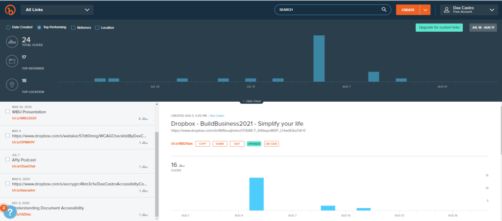
Well, I will tell you, and I don’t know if most people know this or not, but Bitly URLs are trackable. If you’re releasing a document, and it’s got a long URL, and you want to have some metrics on how many people are interacting, so I just spoke yesterday at Build Business 2021. And I had some my slide deck and a handout, a level of effort matrix. We’ve actually even talked about it on this program. And I offered those for download. And I can look in here and I use the Bitly link. I can see exactly how many people downloaded it. I can see what time they downloaded it, and the time of day. I can see what day of the week they downloaded it. So over time, you can get metrics. If you’re releasing a report on environmental impacts, and you want to have metrics on engagement for your community, what better way than to track the URL inside your document?
Chad Chelius
Absolutely.
Dax Castro
And another thing people don’t know is that if you pay for Bitly, you can actually brand your URL, your Bitly link. It doesn’t have to be bit.ly/whatever. It can be your own branding. Adobe has this. They use the Adobe… I think, it’s adobe.ly or ado.be or something like that. I forget what it is, but they’ve got their own branding for it. So it’s a great resource guys.
Chad Chelius
Yeah, for sure.
Dax Castro
All right. So Colleen, I love your website. Your website is so clean. The color scheme is so great.
Colleen Gratzer
Thank you.
Dax Castro
No, really, it really is. And when I go look for your podcast episodes, I just feel zen when I got there, because it’s just so… I don’t know. It works for me, definitely. You talk about a little bit about how you came to kind of choose that color palette and how color kind of affects your branding when it comes to accessibility.
Colleen Gratzer
Yeah, so I chose those colors because orange is a really vibrant, and energetic and friendly color. And blue, well the shade of blue, that is a darker blue, is a good like trust building color. So I really wanted [it]. And it’s funny because I had actually thought about using these brand colors to rebrand my Gratzer Graphics business years ago. And I went and bought all these envelopes that were orange, and then blue. And it’s funny because they’ve been sitting in my basement in boxes for years and then when I created this company Creative Boost three years ago, I guess, it was like in my mind about what I could do the right. So subliminal to use these colors. So it’s funny. So that’s what I… Like my laptop cover is orange. The cord on my microphone, boom arm is orange. Like, it just ended up that way. It’s just really really funny. So it might be something subliminal that I just gravitate towards it for some reason.
Colleen Gratzer
But with my Gratzer Graphics business, which I… I did that branding 20 some years ago, but then I rebranded before I got into accessibility. And I’ve got like a lime green and a lighter gray. It’s kind of a medium gray, I guess. But those two colors are supposed to be my primary brand colors. And when I went to start working on my site to make it accessible, I ran into a huge issue. And that’s because the lime green does not work against white, and it doesn’t work against gray. The gray that I use. And the gray doesn’t work against white either. So I had to come up with a third color which potentially was going to be that orange if I never created this other company. The instead my secondary color is like Violet purple color. And what happened was when I was going through and fixing the colors to make them accessible, I tried darkening the green and what happened, it became so dark, it was like an army green. And the gray, I can make a little darker without anybody really noticing it. But then for like headings, and all these other text elements, I had to use the purple. So my site is a lot more purple than I want it to be. And what happens is that really gives a different effect that I’m looking for. So it doesn’t have like that. It still has a warm feel, but it doesn’t have like the same field that like just lime green, and the gray would have. So it’s something to consider when you’re creating a brand, because even if your logo… You know, logo doesn’t technically have to meet contrast requirements. But here’s what happens when you create a logo that doesn’t use colors that meet contrast requirements, you end up with a branding issue. And it affects everything.
Dax Castro
Well, one of the things I think people forget is that color should be like one of the first things you hammer out. I mean, there’s designed tools, you know my plugin, my Color Contrast Validator.
Colleen Gratzer
I love your plugin.
Dax Castro
The color contrast validator allows you to pick from InDesign automatically, and it creates a color matrix. But there are other ones out there. The one that I tend to push people toward the most is color.adobe.com. Right? So at color.adobe.com, you can actually… There is a tool that says accessibility tools, and here you actually can import colors from your cc library. So if you create a creative cloud library in your InDesign doc, you can actually import it into the color.adobe.com and start playing around with it, and maybe you’re gonna end up changing it, and it’ll save to your library, and then you can update it. So it really is a really cool playground for trying to come up with that color scheme, because it does tell you… They have the color wheel. And you can extract a theme from a document or the accessibility tools. They’ve got the colorblind safe checker which is more of a color wheel. You can drag stuff around. And then of course, the color contrast checker, which allows you to pick certain colors. So definitely some good tools to use.
Colleen Gratzer
Yeah, and then the other thing too with having… When you’re creating an accessible brand color palette, you’ve got to have a style guide to go with it, so that everybody is on the same page. And then you can let people know, “Okay, you can use these two colors at this size.” Because you’ve got body tags to account for headings, maybe image borders, form field borders, bullets and other kind of decorative elements. So if you can put together a guide that tells them you can use these two colors for body text, or for these larger headings, or you can use this color because borders are decorative. You can use this as your image border. You know, that goes a really long way, because otherwise people might just be adjusting colors all the time. And then you end up with like, you’ve got your one document that looks this way, maybe for print, and then you’ve got your accessible file that looks totally different because you change the colors.
Dax Castro
Well, it goes back to not understanding the requirements. You know, I talked about this on my session yesterday at Build Business, about one of the myths of accessibility is that accessible documents can’t look great, they can look pretty. And I find that most of the time when people start making color decisions to use colors or tone it down or make it black and white, it’s all because they don’t understand the rules about what colors can go with other colors. And then they just like “Forget it. I don’t want to learn this. I’m just gonna make it grayscale or I’m just gonna make it black and white.” You know, they start making design decisions that actually hurt the aesthetic of their document.
Colleen Gratzer
I actually had a client do that. They hired us for an email design and they said, “You know, we would at least like to have an accessible writing for this.” So we created it with the colors that they gave us. And then the client asked a few questions and I’m like, “Well, these are the colors that we’re working with. We thought this is the best way to get them to work together. We made some slight design changes and also some slight modifications to those colors.” And then at the end of the process, the client said, “Well, there are other colors in the brand color palette, but I didn’t send them to you, because they were too late and I didn’t think that they were accessible.” And I was like, “Are you kidding?” Like my mind was blown. I’m like, “Why did you make that decision?” Because… And a lot of designers think this too. Accessible color combinations is not about using dark colors. I mean it’s how they’re used. There is no color that’s not accessible. It depends on what it’s being used against.
Dax Castro
Exactly. And that’s a point I try to make all the time there. Most colors like yellow in itself is not a accessible when you use it with text or when you use it as a bar chart. But barring the lighter colors, almost all the other colors are just about what combination you use it with. And if you make your objects, like I can have a yellow triangle, if I want, I add a border to it or add something… You know, maybe I put it on a different color background than white, because remember, the background is a color, even though we don’t think of a background of a page as a color, really, it is white. So every color starts with the color contrast between itself and white. So definitely something to think about. And if you’re not using the Color Contrast Analyzer, which is by TGPi, by the paciello group, they’ve actually been renamed TGPi. And I use that so much. I mean, literally every single day, I’m using the color contrast analyzer. And I definitely, highly recommended. If you don’t have that tool, go search for it right now and download it, because it really does make a huge difference. And I cheat sometimes. So if I have a graphic that I want, and maybe it’s a web page, I’m like, “Oh, I love that color.” And I want to bring it into Photoshop or Illustrator, InDesign or whatever, I’ll open the color contrast analyzer, just use the eyedropper tool to sample that color and get the HEX value or the RGB.
Colleen Gratzer
Well, there’s a caveat with that tool, though. It’s a great tool. And I love that. You can put the hexadecimal and RGB into, so it’s not just about sampling, but the sampling is like really helpful. But I had a client once, take the final accessible PDF, and then they sent it to their approving organization, and their accessibility person looked at it and they’re like, “Well – and it was orange – this orange doesn’t pass.” And I was like, “That’s like the first thing I check in every project.” I’m like, “I know it passes, and I had proof of it.” So anyway, I’m like, “What are you checking it with?” And she was sampling color. So I said, “The hex value is fine and it works.” And so when you sample it sometimes off, and sometimes that is enough to be the difference between a pass or a fail.
Dax Castro
You know Colleen, as soon as you started mentioning the story that you were going with, I immediately remember that conversation. You had that conversation. And I went, “No, it works.” And there’s no way. It’s got to be. I didn’t believe you when you said it. And I did a test. Immediately, I went and did a test. I’m like, “Oh my gosh, you’re right.” The eyedropper sampled a different color than the hex now. It’s splitting hairs. I mean, when you’re talking about the difference between, like 0.5% for a pass to fail, it definitely is different. And that’s why when I’m trying to get my color contrast values, I typically cheat a little bit darker. Like the color contrast analyzer, when you start dragging those sliders around to get your and watching your color contrast move up, I typically don’t stop it at 3 to 1 or 4.5 to 1, I cheat just a little bit more, just so that I can make sure that I don’t have to worry about somebody is monitor setting or something [is] going on. So definitely a good point. Try not to… You know, if your goal is to how close can I ride that line of accessibility between compliant and non-compliant, you’re not always going to be on the right side of that.
Dax Castro
It is time for “Who’s on Twitter” We are not going to get… I’m not going to leave this one off. Normally, we do at the middle of the show, but I think we’re getting closer to the end here our “Who’s on Twitter”, and Chad, you have the “Who’s on Twitter” this week. So Chad, Who’s on Twitter?
Chad Chelius
Yeah. So this week on Twitter, we have Paul Sweeney Jr. His Twitter handle is @vphreak. So I think that’s VPhreak. I’m not exactly sure. But Paul Sweeney Jr. is a software developer who tweets about def, tech, coding and JavaScript. He also creates video contents in American Sign Language on various topics. So I just thought it was really interesting. On his Twitter feed, he’s just kind of introducing himself and he’s got a lot of different tweets that he has posted about different topics on accessibility. And it’s just a really interesting Twitter find.
Dax Castro
Yeah, you know, I’m looking at his profile here and he’s got some good stuff. I really like his use of captions on this video that he posted on. It’s his little introduction of himself. Because they’re actually open captions. Normally, we talk about closed captions, which are the automated ones. These are open captions which are actually burned into the video. But the nice thing about it is they’re super easy to read. They’re very few words as they follow along. And they actually follow along with the sign language. I can understand sign language enough to be dangerous. But it’s nice to see that he’s taken the same approach to making sure his captions are timed with his sign language as well. So, kudos to him and great. I’m definitely going to take a better look. And it’s funny, he’s got one of those old composition notebooks I used to have in science class.
Colleen Gratzer
I love that.
Dax Castro
It brings back memories. I used to be a hoarder of those.
Colleen Gratzer
I did too.
Dax Castro
I would never throw them away. Oh my gosh!
Colleen Gratzer
I did too.
Chad Chelius
In one of his tweets, he mentioned that, after shaving his beard, face ID still recognized him. And he was happy about that. So it’s really, really interesting.
Dax Castro
That is funny. That is funny. Awesome. All right. We are just about at the end of this podcast. Colleen, why don’t you give another little plug for your services again? And I will tell you guys, I mean this from the bottom of my heart. Her podcasts are exceptional. If you are in the design space and you are struggling with how to talk to your client, how to price out your work, self-worth, value building, a clientele, how to say no to a client, which I think so many people, Colleen, get in that part where they’re just like, “Yep, no problem.” And then you’re up at 03:00 in the morning because you said yes to something you should have really said no. So give us a little bit more about where people can find you and what they can expect.
Colleen Gratzer
Well, you can find my podcast Designed Domination on most of the podcasting platforms at www.creative-boost.com/podcast. And that’s also where I have an each podcast written like an article, but there’s also the audio, so it’s totally accessible. And I also have digital products and tons of free guides and courses. I have accessibility courses. One is on accessible branding and design and one is on website accessibility. And then my…
Dax Castro
Awesome. There is one that I was looking at 9 InDesign Accessibility Mistakes that Designers Make, and I was like, “Yep, yep, yep.” Right on down the line, I was like, preach it sister, you got it.
Colleen Gratzer
And then I have a few free guides that are accessibility related. One is 5 Mistakes that Web Designers and Developers Make When Creating Accessible Websites. And then I have one on understanding and selling accessible websites. And then I just came out with one that is alt-text made easy.
Dax Castro
Oh awesome. That’s great. Well, I’m looking forward to seeing you at CreativePro week InDesign and Accessibility Summit coming up in the next few months. Now, that is going to be another online experience, but I always look forward to your presentations.
Colleen Gratzer
I like yours too.
Dax Castro
What I like about them…? Well, you know, it’s funny, because you are the antithesis of me. You are my anti-Dax. I speak a mile a minute. And I never shut up and I never take a breath. And you really, it is a refreshing pace to listen to you talk, because you have this pause when you say something. At first, I was like, “I think…” If you remember, I think I pulled you aside one time. I’m like, “Hey Colleen, you know, you’ve got this awkward pause in there while speaking.” And she’s like, “Dax, actually that’s on purpose. Because not everybody is a mile a minute. And some people need time to digest. And you don’t have to said that.” I went back and listen to them. Like, you know what, she is absolutely right. So I will tell you that I tried it very unsuccessfully, I might add, but I try to think about pausing in between my thoughts to give people a chance to digest, so I really enjoy your presentations.
Colleen Gratzer
Thank you.
Dax Castro
And thank you so much for being on.
Colleen Gratzer
Thank you. I really appreciate it. It’s always great talking to you both.
Chad Chelius
It’s great talking to you, Colleen. And Dax, I mean, for the record, I never noticed that you spoke a mile a minute (sarcastically stated).
Colleen Gratzer
I don’t think so.
Chad Chelius
Until you just mentioned it.
Dax Castro
I can see your tongue from here, Chad. And we’re on ZOOM, a million miles away.
Chad Chelius
But Colleen, it’s really been great having you on here. I mean, in the last year and a half, we’ve missed out on so many conferences, which is really the only time we truly get to see each other in person. And so we’re kind of resorted to virtual friendship, just like everybody else. But it’s really great to see you here and to have you on and share your knowledge with our audience. So thanks again for coming this week.
Colleen Gratzer
Yeah, thank you.
Dax Castro
And speaking of conferences in person, I will tell you that baring any COVID blow ups, November 15th, through the 19th, I will be speaking at Accessing Higher Ground, which is where I first started learning about accessibility from my mentor, Bevi Chagnon. And I’m going to be giving a pre-conference, full-day session on accessible infographics at accessing higher ground in person in Colorado. So that’s accessinghigherground.org for those of you who want to know. Chad, we are at the end, man. Thank you so much for being my co-host. And why don’t you take us out of here?
Chad Chelius
Thank you, Dax. Well, once again, we’re at this point where we’re looking for sponsors of our podcast. So if there’s anybody out there who has any interest in being a sponsor on our podcast, please reach out to us. As for this episode, once again, we want to thank AbleDocs for being our sponsor. AbleDocs is makers of axesWord, axesPDF, as well as document remediation services. So we want to thank them for their support. My name is Chad Chelius.
Dax Castro
And my name is Dax Castro, where each week Chad and I unravel accessibility for you.
Chad Chelius
Thanks, guys.